01
Harel design system
As a part of my work at Matrix Experience, I was the lead designer of the Design system created for Harel insurance company. Harel’s Design System based on the behavioral principles of Google Material Design combined with the unique graphic language of the brand.
When most of the DS completed, Me and two designers I, designed the company’s projects based on its principles, logic and rules
Duration
1 year
Design System, Product Design, Illustrations
Skills
Credits
Yuval Hadad (UX Expert), Nati Talker (UX/UI Designer), Roy Itzhaky (UX/UI Designer)
.png)


Timeline
Apr 2020 - May 2021
Responsibilities
Design System, UX/UI, Research, Prototyping, Illustration
Tags
Desktop, Mobile, B2C, Design System

Fonts

The company has a font specially designed for it, which is used in all of its products. It comes in three different weights: light, medium and bold, and in a variety of sizes according to the needs and the content, to allow versatility and interest, without losing the uniqueness of the font and the typographic uniformity. The font is sans-serif, has rounded corners, sharp and straight edges, and it's overall shape is clean. The advantage of this font is that it is not a niche or explicit font, but it is readable and harmonic.
Main Color Palette

#2D76CB
#F7B207
#2D9D3A
#FFFFFF
#C7E1FF
The company’s brand represented by the use of a color palette of three main colors: blue, yellow and green, in a variety of shades. The leading color is blue and the secondary colors are green and yellow.
The blue color conveys reliability, peace, space, inspires a sense of security, and encourages productivity. The green color conveys health, serenity, harmony, associates with money and economic wealth, and the yellow color increases optimism and enthusiasm and helps to attract impulsive users and motivate them to action. Together, these three colors creates diversity, joy and harmony.
Harel's products are supposed to use color rationally and purposefully, to help draw attention to what matters most and support the hierarchy of the elements.
01
The Challenges

Material design combined with brand identity
Creating a delightful Design System for a well-known insurance company with an established visual language presented a unique challenge. I needed to adapt Material Design principles while preserving the brand’s recognizable identity. This required careful adjustments without compromising the consistency, behaviors, and modern aesthetics that Material Design provides.
Inconsistencies in the Existing Interface
When I first explored the existing designs, I noticed a lack of uniformity among components that should have appeared consistent - buttons, pop-ups, icons, typography, and even color usage. Multiple shades of blue, varying font weights, and inconsistent component structures all contributed to a fragmented visual experience. Bringing these elements into alignment became a key priority.
Designing for Scalability and Team Use
From the beginning, it was clear this would be a long-term initiative that future designers would continue to build upon. Therefore, it was essential to create a Design System library that was intuitive, well-structured, and easy for other designers to adopt. Ensuring long-term scalability and team accessibility was a core part of the system’s foundation.
02
Conclusions

A clear visual hierarchy and thoughtful integration of brand elements with Material Design will be essential for creating a unified and contemporary interface that reflects both usability standards and the company’s identity.
A visual language that aligns brand recognition
Consistency across visual elements
Establishing consistent rules for components, typography, spacing, and color usage will be crucial. A unified system of components and elements will help create patterns, support accessibility, and strengthen the overall user experience as the product evolves.
A scalable system built for long-term growth
Building the Design System with clarity, naming, and organization will ensure that future designers can easily adopt and expand it. Prioritizing scalability and documentation will support long-term collaboration and maintain design quality as new features join the project.
03
Design system assets


.png)


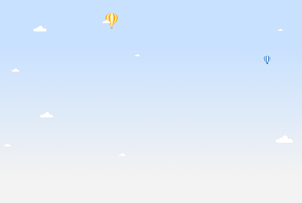
When we started to design Harel’s projects based on the DS, one of our main goals was to maintain uniformity in the same types of screens and elements repeating themselves. Yet, we were not willing to compromise on creativity and uniquness, so we kept creating new illustrations, icons and components according to the different themes.
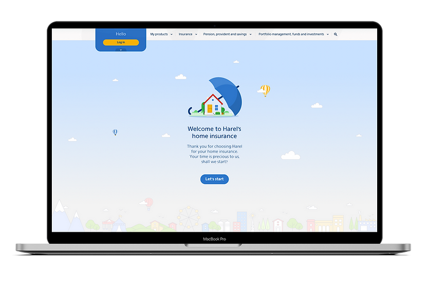

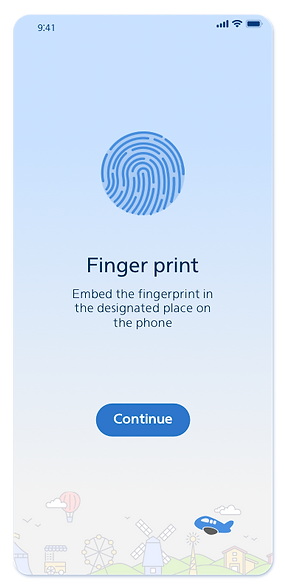
Welcome screen - Home insurance
04
Projects based
on the Design System
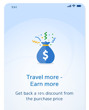
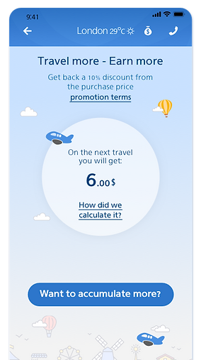
Abroad App
The App contains everything that the insured needs while he is abroad, such as locating a doctor, ordering an ambulance, getting refunds for lost luggage or medical treatments, discounts and benefits, etc.


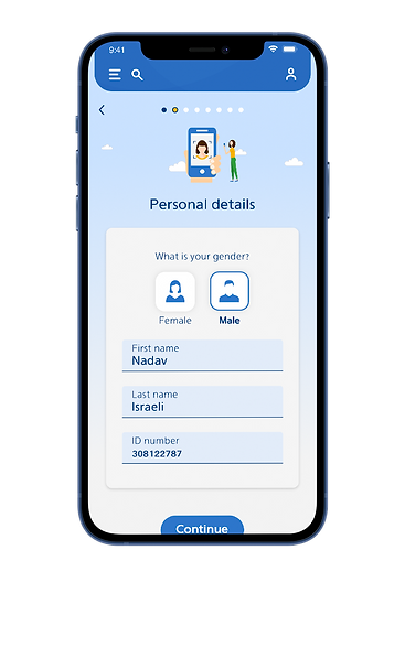
Joining insurance plans
Selected screens from different projects

Health Indurance
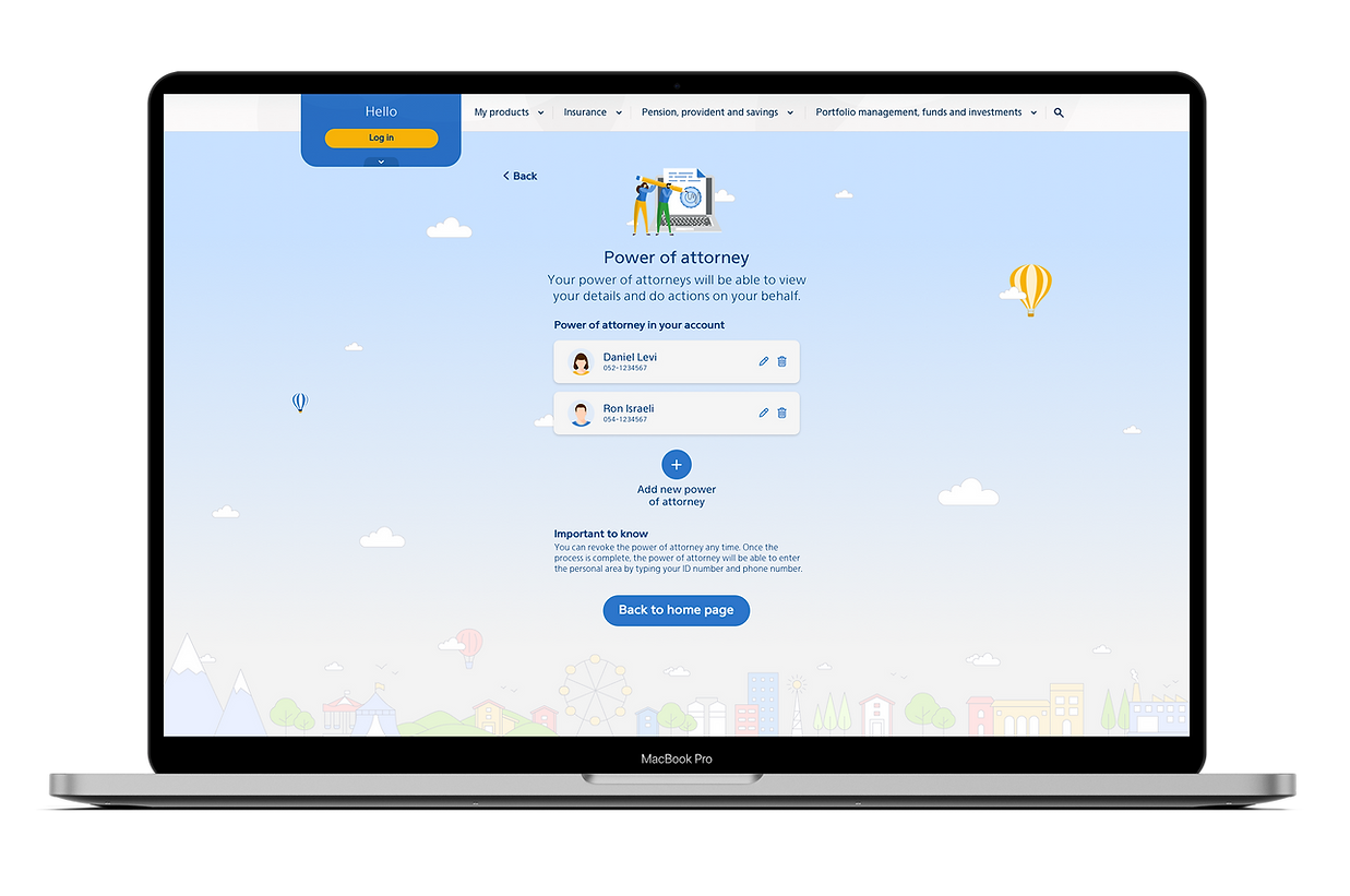

Power of attorney

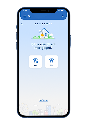
Home Insurance

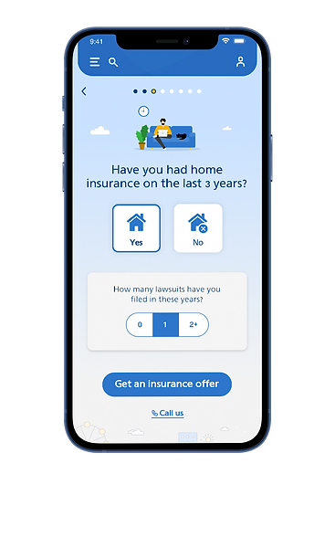
Home Insurance


Saving plan
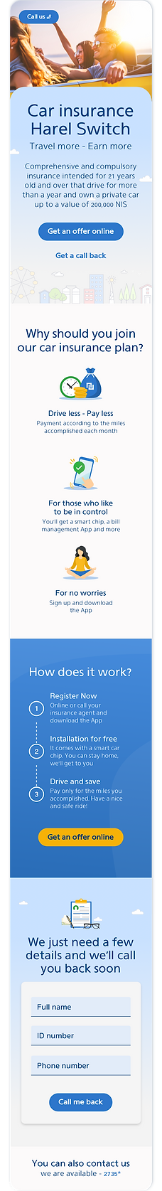
Landing page template
The landing page template is based on the Design System, of course, but we still had to rethink it due to two reasons:
-
This is a marketing product that needs to be sold, not a time-consuming project like those we designed in the past. from that perspective, it was necessary to enlarge the buttons and the main titles.
-
We had to create a generic template for the marketing department, so it would be easy for them to replace every element on the page, like pictures, icons and text. from that reason, we chose to use a photograph instead of an illustration, and selected a generic icon for the details area.
Mobile

Desktop